Canberra Grammar School
BRAND STRATEGY
VISUAL IDENTITY
INTERACTION DESIGN
–
THE BRIEF
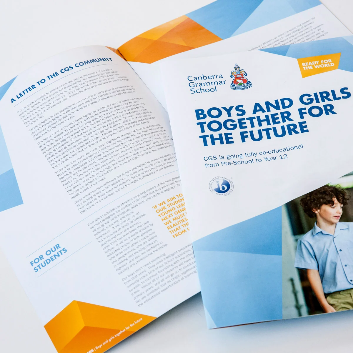
After 86 years as the most respected boys’ school in Australia’s capital city, Canberra Grammar School was about to undergo the most significant change in the school’s history by becoming fully co-educational.
THE PROCESS
The new offer required a rebrand: a new brand value proposition that clearly communicated the direction that the school was taking and a visual identity that aligned with their values. A new tagline, ‘ready for the world’ replaced previous inconsistent messaging.
The brand was launched simultaneously online and in print, with a redesigned website and a publication announcing the new coeducational model.
A key feature of the new website is the interactive prospectus, that gives parents a personalised overview of the school and entry points to the website, based on their child’s unique abilities and interests.
THE OUTCOME
The impact of the new offer and rebrand has been significant: enrolment applications increased by over 50%, attendance at Open Day increased by over 60% and engagement with the website increased.
“Fiona brought sharp insight, strategic thinking and a superb creative sense to the School’s planning and brand expression.”
– Dr Justin Garrick, Head of School,
Canberra Grammar School.
2015 - 2016
Studio: Blueboat
Role: Creative Director
Royal Australian College of General Practitioners (RACGP)
USER EXPERIENCE DESIGN
INFORMATION DESIGN
IDENTITY + MESSAGING
—
THE BRIEF
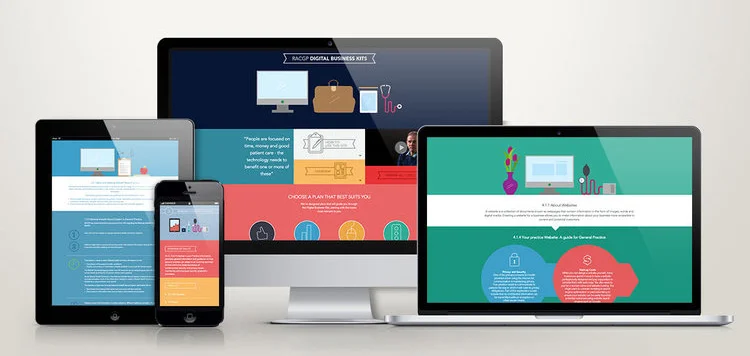
The Digital Business Kit initiative was an Australian government program, that funded ten industry peak bodies to develop online resources to encourage the uptake of new technologies and processes in their industry.
The Royal Australian College of General Practitioners (RACGP) partnered with Blueboat to develop, design and build a kit to help GPs improve patient care and increase business efficiency.
THE PROCESS
User research including interviews with key target audiences and a review of best practice online tools informed the concept and project design.
UX mapping and user profiles helped the client to understand our visual design, information architecture and messaging recommendations. Entry points to the kit content reflect the different ways that the intended audience would work through information – either self-identifying their skill level to start a tailored plan, or working through the whole kit by topic. Difficultly levels and time required estimates were included for each module, allowing users to plan their time.
THE OUTCOME
The RACGP Digital Business Kit was launched on time and on budget with a fantastic reception from both RACGP members and the funding department.
—
2014
Studio: Blueboat
Role: Creative Director
Toll Consumer Delivery
BRAND + IDENTITY
INFORMATION GRAPHICS
DIGITAL PLATFORM DESIGN
—
THE BRIEF
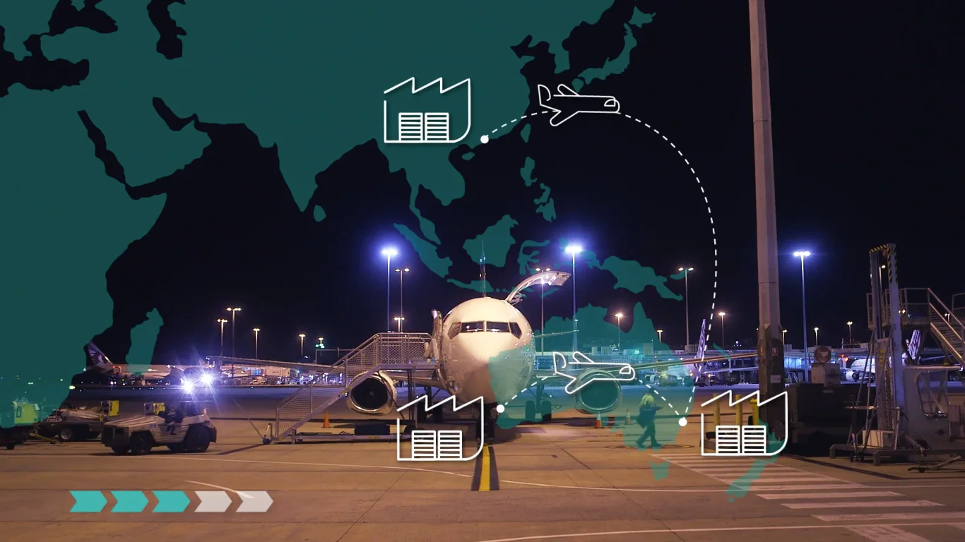
In 2012, Toll, Australia’s largest logistics company, launched a new Consumer Delivery service for online retailers. In order to sell this offer – first to businesses, and then to consumers – Toll needed not only sales materials, but a clear understanding of the service they were developing and its value to the market.
THE PROCESS
Understanding the new service and the competitor landscape required extensive research and internal consultations. The project included:
• A Brand Value Proposition (BVP) for the new service
• Infographics defining and visualising the new service
• Design of print and digital sales materials
• Design of exhibition stands and displays
• Concept and art direction for promotional films.
THE OUTCOME
The most rewarding moment of the whole project was when Toll’s Head of Strategy unfolded the delivery process information graphic and exclaimed,
“This is what we do!”
No one inside the organisation had articulated or visualized the new service in full before. It became a valuable tool for internal communication between management, sales and operations divisions before it was presented to customers.
The success of this project led to Blueboat undertaking brand positioning and sales process design projects for the four Australian-based Toll business units, developing Brand Value Propositions and promotional materials for each.
—
2012
Studio: Blueboat
Role: Lead Designer
Australian Renewable Energy Agency (ARENA)
DATA VISUALIZATION
SOCIAL MEDIA CAMPAIGN
INFORMATION GRAPHICS
—
THE BRIEF
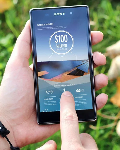
The Australian Renewable Energy Agency (ARENA) had a frustrating problem: they had millions of dollars of funding to allocate to eligible projects, but they were not attracting enough applications.
Blueboat was briefed to create a series of infographics and a social media campaign, Tomorrow's Energy, to promote ARENA’s funding priorities and attract new project applications.
THE PROCESS
The project included working collaboratively with ARENA to:
• Define their target audience, as well as their needs and online habits
• Develop a campaign architecture showing the purpose and placement of different elements on social media
• Develop a campaign tagline for the Tomorrow’s Energy initiative to be used throughout the campaign
• Design a series of large scale infographics with shareable social media graphics and email tiles.
THE OUTCOME
The campaign led to ARENA’s highest ever levels of social media engagement, ultimately exceeding the client’s expectations for funding applications.
The design was also applied to a suite of publications.
—
2015
Studio: Blueboat
Role: Creative Director
Centenary of Canberra – The Skywhale
BRAND IDENTITY
INTERFACE DESIGN
EDUCATIONAL RESOURCES
—
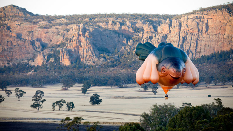
THE BRIEF
The Skywhale is daring, large-scale sculpture by acclaimed Australian artist Patricia Piccinini. Built and flown as a hot air balloon, the artwork was commissioned as part of the Centenary of Canberra festival, celebrating 100 years since Australia’s capital city was founded.
It has a gentle face, 10 pendulous breasts, and was largely taxpayer-funded. It was certain to be controversial.
THE PROCESS
As opportunities to fly the balloon would be limited and weather dependent, there was a need for captivating imagery, film and online resources to ensure as wide an audience as possible.
A website and social media channels were developed to showcase imagery and provide context for the sculpture: interviews with the artist and references to her previous work aimed to inform and contribute to the public conversation that the Skywhale prompted.
Educational materials were also developed for primary and highschool students.
THE OUTCOME
The Skywhale’s launch made national and international headlines, with the video of its first flight attracting 80,000 views in the first 48 hours and social media attention engagement expectations, with critics and fans engaging on Facebook, Twitter and Instagram.
—
2013
Studio: Blueboat
Role: Lead Designer
Melbourne Brain Centre
INSTALLATION DESIGN
VISUAL STORYTELLING
DONOR ENGAGEMENT
—
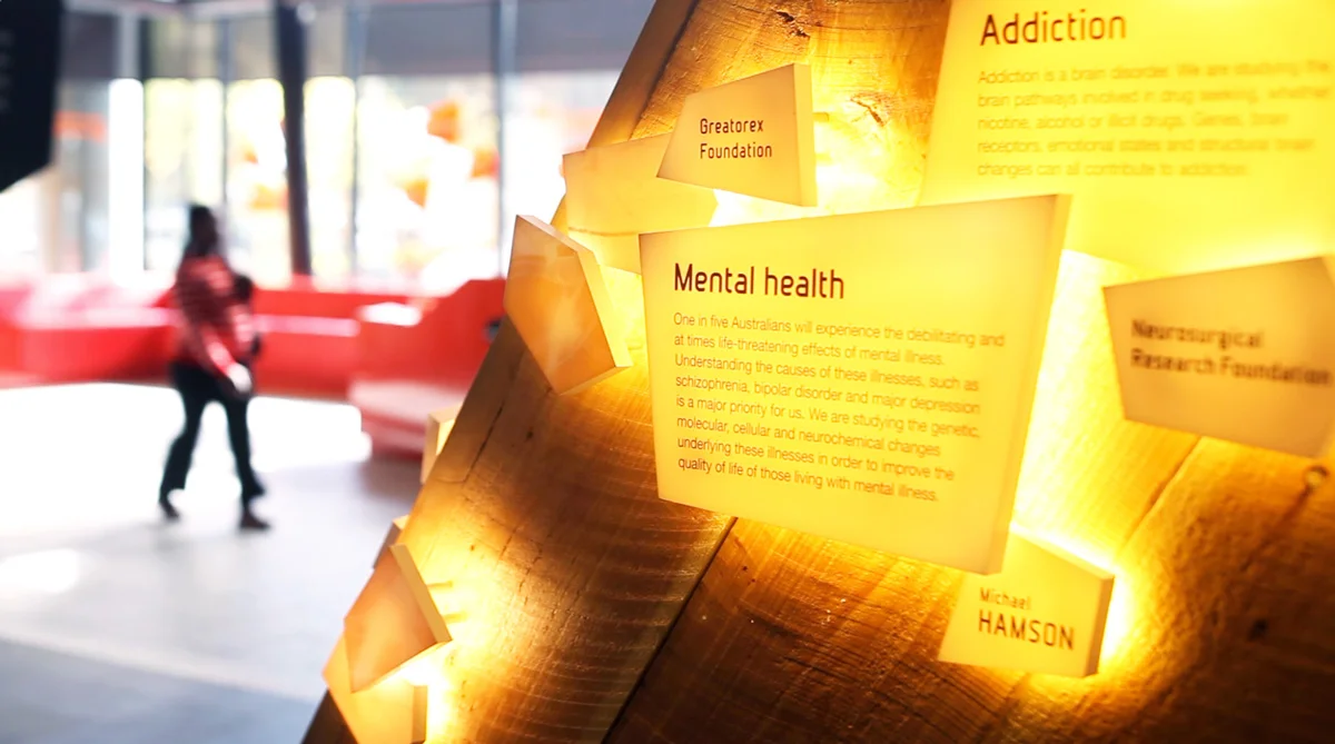
THE BRIEF
The Melbourne Brain Centre is home to Australia’s largest brain research collaboration, bringing together five neuroscience and mental health research institutes in landmark, state-of-the-art facilities. When theCentre was first established, the partners identified a need to recognise donors and a strong desire to retain some link to the history of the individual institutes.
THE PROCESS
Based on previous consultation and workshops with the MBC stakeholders, I designed a series of installations to visually tell the Melbourne Brain Centre’s brand narrative. They celebrate a history of brilliant achievements, recognising ongoing innovation and inspiring future researchers.
Window displays celebrate the achievements of past researchers. Interactive light installations explain research that is currently being undertaken and the names of donors, linking their financial support to scientific progress.
THE OUTCOME
The installations have become landmark features of the Melbourne Brain Centre with researchers aspiring to see their own research added to future updates.
“I’ve been thrilled by the international visitors who have come to the Florey’s foyer to take photos and soak up the atmosphere. I’ve come across people from London, Singapore and New Zealand who had heard about the light displays and window tributes and felt they just had to come and see for themselves.” – Amanda Place.
—
2012
Studio: Blueboat
Role: Lead Designer
Monash University
PUBLICATION DESIGN
INFORMATION GRAPHICS
PROJECT MANAGEMENT
—
THE BRIEF
Monash University is Australia’s largest university. The course guides are their primary student recruitment tools, that set the design direction for publications and promotional materials for the year.
2013 was the first time that a single agency designed course guides for all Monash faculties. The suite of publications had to clearly embody the Monash brand while communicating each faculty’s unique offer.
THE PROCESS
To start the project. I ran a workshop with recent highschool graduates to better understand our audience’s needs and brand perceptions. Ongoing user testing informed refinements to content and information design.
As Creative Director on the project for three consecutive years, I developed the design direction, led a team of designers and worked with diverse stakeholders from the university. Managing multiple rounds of content changes while ensuring consistency between publications required thorough processes, attention to detail and exceptional client management skills.
THE OUTCOME
A unified graphic style was developed for bold illustrations and information graphics that came to define the university’s visual identity. Monash continues to be a major client of Blueboat, for the annual course guides as well as ongoing strategy, brand and publication design.
—
2013 - 2016
Studio: Blueboat
Role: Creative Director
Scotch College – Centre for Science
CAMPAIGN STRATEGY
DESIGN DIRECTION
FILM + APP
—
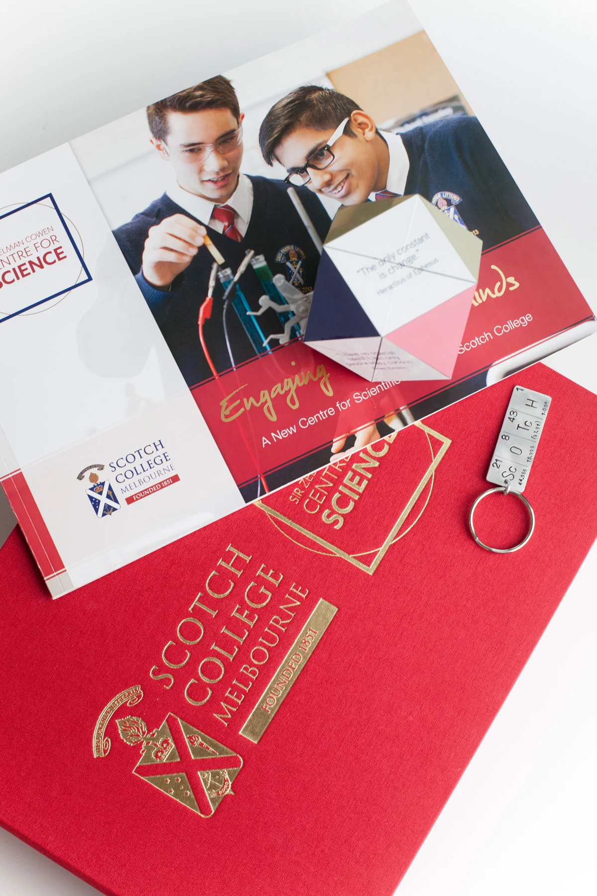
THE BRIEF
Scotch College needed to raise $20 million from their community, to build a new $40 million Centre for Science. It was the school’s most ambitious fundraising and building project in the last 10 years. The brief was to raise the profile of science at the school as well as re-establish a culture of giving.
THE PROCESS
The project began with consultation, interviewing students and alumni to develop the campaign strategy: framing science as an essential part of every student’s education, rather than exclusively as a career pathway to STEM. This ensured that the campaign would appeal equally to parents of less academic students.
As lead designer, I developed the campaign name, tagline, themes and messages as well as designing the campaign brandmark and visual design. I led the design of print and digital collateral including a booklet, presentation box, donor gifts, iPad presentation, films and a website.
THE OUTCOME
The campaign was awarded Best Capital Campaign in 2014 by Educate Plus and reached its fundraising target in December 2015.
Due to the success of the campaign, Scotch College engaged Blueboat to design its next two campaigns.
—
2014
Studio: Blueboat
Role: Lead Designer
Scotch College – Indigenous Scholarships
COMMUNITY ENGAGEMENT
CAMPAIGN STRATEGY
VISUAL STORYTELLING
—
THE BRIEF
After the success of the Centre for Science campaign, Scotch wanted to shift their focus to the need and value of their Indigenous Scholarships program. The brief was to increase awareness and understanding of the Indigenous Program at Scotch College and raise $7.5 million to establish a perpetual scholarship fund.
THE PROCESS
The starting point for the project was interviews with scholarship recipients, students who had participated in partnership activities with indigenous communities and the teachers who run the program. It was important that our campaign captured the experiences and voices of the students we were setting out to support.
The project included:
• Campaign brandmark, tagline, graphics and messaging
• A series of films featuring students and graduates
• A campaign booklet, donation form and other collateral.
THE OUTCOME
The campaign has already received strong support from the community, since its sold-out launch dinner in May 2016. The next event in the campaign will be a fundraising art show.
—
2016
Studio: Blueboat
Role: Creative Director
Blueboat
BRAND VALUE PROPOSITION
BRAND IDENTITY + CULTURE
INTERFACE DESIGN
—
THE BRIEF
Six months after I started working at Blueboat, I was given the project of rebranding the studio: first the visual identity, then promotional materials including the website. Once I became Creative Director, I expanded this to include the brand value proposition and culture.
THE PROCESS
As part of the project, I ran two internal workshops. The first was to encourage collaboration and ownership of the brand values by the wider design team; the second to ensure the team fully understood and lived the brand through their interactions with clients and each other.
Over the years, the ongoing brand work included:
• Visual identity: logo, hand-lettered type, colour palette, image, typography
• Brand Value Proposition: messaging, personality,
tone of voice and studio culture / expectations
• Website design and copy writing
• Print design including stationery, collateral and signage
• Design direction for studio and self-promotion projects
THE OUTCOME
The brand has been robust, easy to work with and Blueboat clients have a very positive perception of the brand: especially the way that it is authentically brought to life by the team.
—
2012-2016
Studio: Blueboat
Role: Lead Designer, Creative Director
Self-initiated project
SERVICE DESIGN
SYSTEMS THINKING
DESIGN & ILLUSTRATION
—
THE BRIEF
A response to housing accessibility and sustainability: a service and product design concept aimed at making shared households an easier and more effective housing option.
THE PROCESS
Through research and consultation with our target users, the following objectives were established, and solutions to each were designed:
User objective 1:
Find compatible housemates
Services / products:
• Website with house search functionality
• Monthly market
User objective 2:
Manage shared households effectively
Services / products:
• Online household management tools
• Household diary
• Housemate notes
User objective 3:
Live in an environmentally and socially sustainable way
Services / products:
Throughout the system, information and solutions consider environmental and social impact.
—
2010
Student project
Swinburne University, Sustainable Design
Project partner: Liisa Vurma
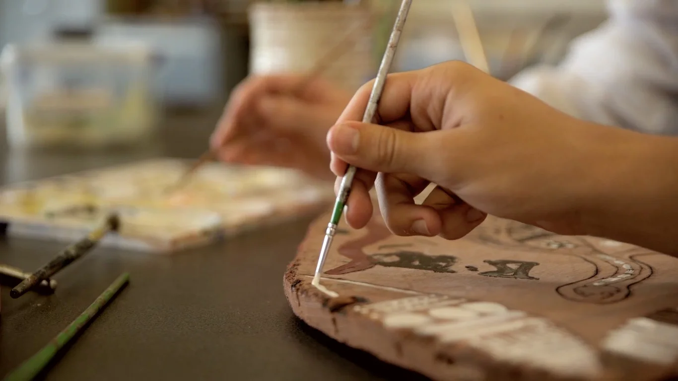
Self-initiated project
A series of three typographic sculptures, in a temporary installation at Merri Creek, Melbourne.
The words escape, dance and flow were created out of knotted sheets, turned into wind chimes and were painted in the water.
The photographs were turned into a book.
—
Self-initiated project